Chloë Meyer
UX Designer


Programs: Figma, Google Slides, Google Forms
Timeline: 3 weeks
For this project I was a UX/UI Designer who
1. Researched using competitive analysis and surveys
2. Produced wireframes, low and high-fidelity prototypes using visual design principles
3. Wrote detailed documentation, including 2 user/task flows
4. Performed usability testing with 5 students and wrote a usability report
Competitive Analysis, Usability Testing, User/Task Flows, Wireframes, Usability Report, Low-Fidelity Prototype, High-Fidelity Prototype ---> View prototype
Project brief: Design, build and user test a digital prototype for a mobile application that solves a specific problem for a target audience and addresses an issue of equity.
Local Loans’ target audience is people who need money for basic needs and have no other way to pay. Essential needs like medications, rent, food, and medical procedures are basic human rights that governments worldwide do not provide enough support for. In my personal experience, I see homeless people on the streets around my town asking for donations and I get personal messages on Instagram from random, desperate people all over the world asking for money. Current crowdfunding platforms, like GoFundMe, Kiva, and Kickstarter, are meant to raise large amounts for a significant life event, but there's a significant need for basic, everyday expenses.
To address this problem, Local Loans is an app to ask for loans from your local community. Community members can easily view loan requests from others and share to other social media; and those in need of funds can quickly post requests. Requests can be anything from someone needing $20 to buy groceries, $300 to help with rent, or $4,000 for emergency medical bills. No interest rate, just people loaning money to those in need, who will pay it back when they can. There is also an option to donate without repayment.
To pick my topic to answer the project brief, my UX/UI design class did a sticky note brainstorm session. We all wrote 5 answers to the question ”What inequalities do you see in the world today?”

To begin my research, I made a survey to help gauge if students were interested in this community-based loaning app. I surveyed 16 students and I found that all except 1 were interested in loaning to someone in urgent need. I decided that was enough interest to make this project worth pursuing.


I performed a competitive analysis using the SWOT method to compare existing applications, like Kiva, GoFundMe, Kickstarter, etc, and see how I can improve on their weaknesses and incorporate their strengths into my project.
From this analysis I found that there are ways to differentiate my app from the competition. I chose to focus my app on the loaning option and the local community each user is in, as these are under-utilized features. I also noticed that a weakness of these other apps is that there are so many requests that it’s difficult to find and choose just one to support. By filtering requests by location and distance from the user, I can reduce the number of requests visible and make it easier for users to decide. This does have some drawbacks that some locations may have more requests and less people to donate, but I can include an option to not filter by location.
See my top 6 takeaways below.

Next I designed gray-box wireframes to plan out all the screens and establish a basic layout. Here are some gray-box wireframe screen examples with descriptions.


I also began designing the visual aesthetic of the app, by first sketching ideas (shown above) for logos and navigation icons. Next I chose a color scheme, typefaces and general brand guidelines to follow.
Then I added more details to each screen to make a low-fidelity prototype, shown below.


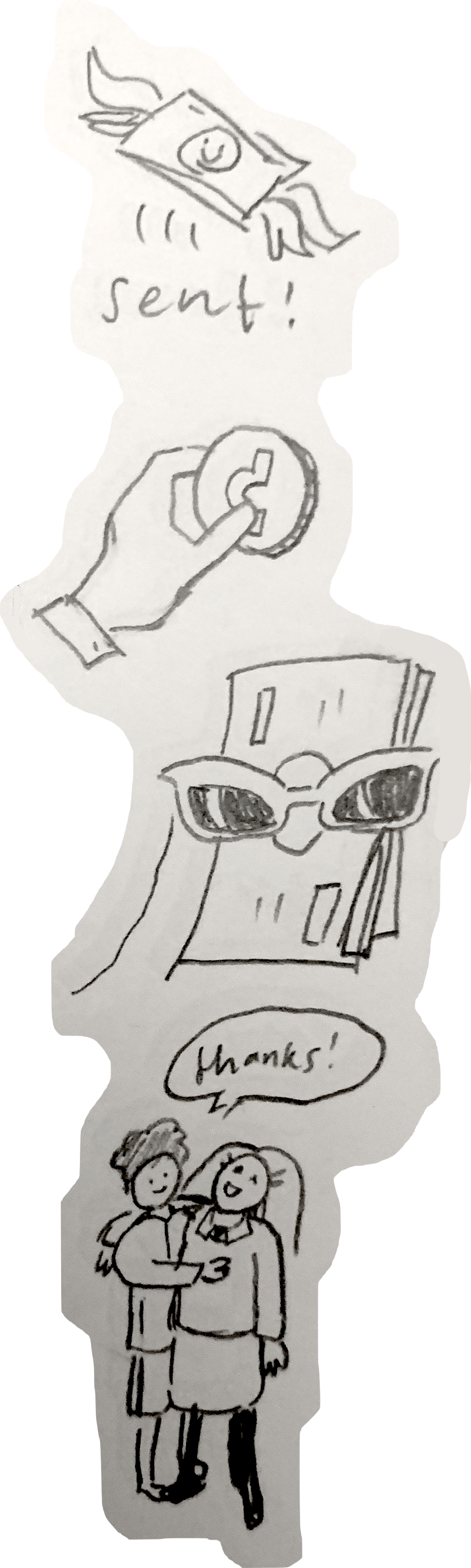
Then I made two user flows for usability testing. The user tasks are to create an account then view a tutorial and to make a loan to someone. For these tasks, I designed a launch page, account creation pages, home page, requests page, loan payment pages, and more.
These are the two user flows:

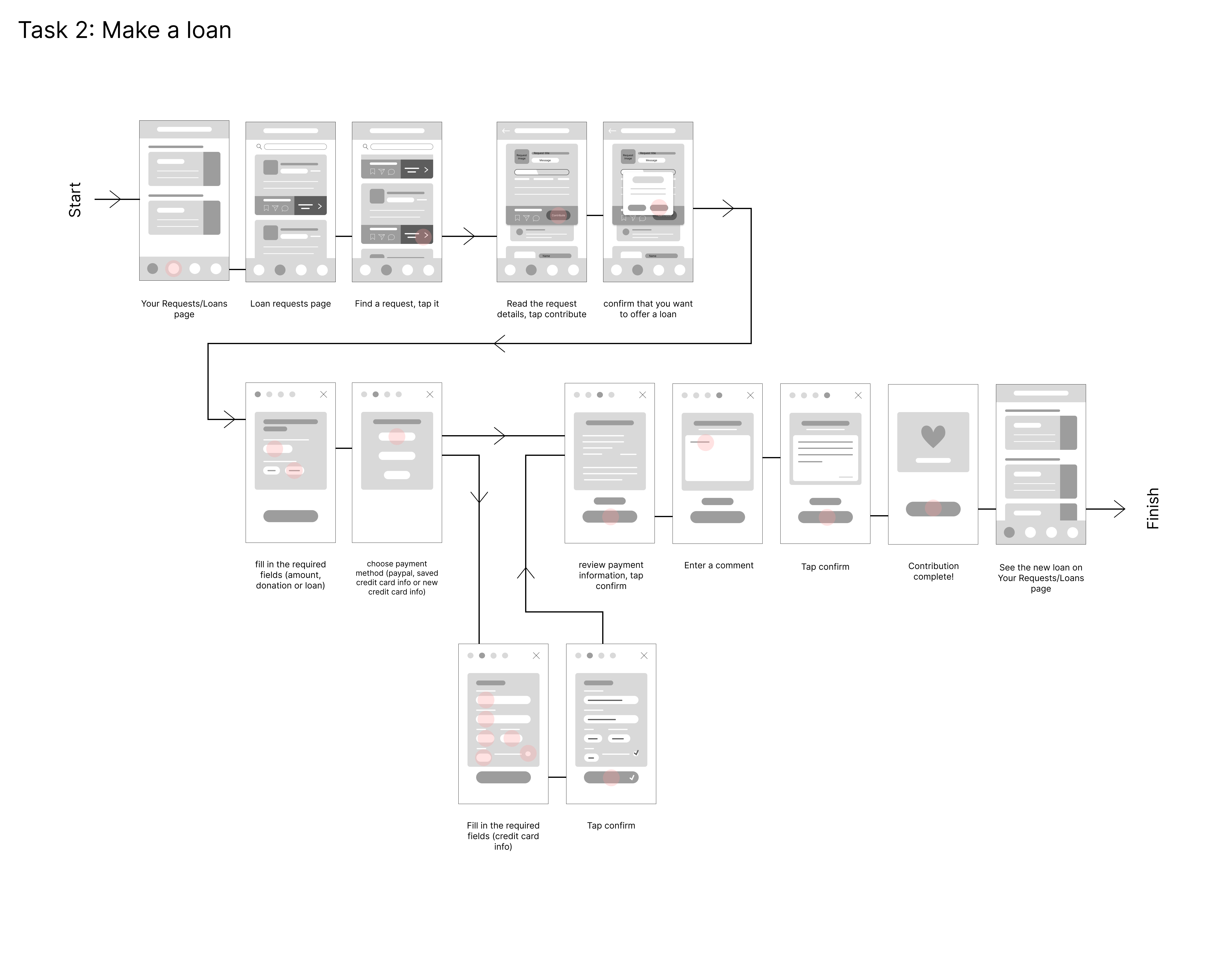
I conducted usability testing with 7 students in my class and took extensive notes on their experiences. This feedback allowed me to observe user interactions and make improvements to my app’s functionality and visual layout. I wrote a usability report on my findings and then added more detail to make low-fidelity and high-fidelity wireframes.
The biggest changes I made to my design were due to accessibility concerns, like increasing contrast between two colors, changing a font that is difficult to read, and making sure button placement is consistent across screens.
I implemented their feedback into my designs to make a higher fidelity prototype. I added two more task flows to further expand the app’s prototype capabilities; these included leaving a comment on a request and looking at your bookmarked requests. If given more time, I would conduct more rounds of usability testing and even A/B testing to make sure my designs were functional before calling it finished. But this was a project for a class so I had to end the project by the due date.


Local Loans serves low-income individuals and helps them get essential funds for everyday needs. It helps communities help each other and stay in touch with each other. It’s a social platform for social good. Rest easily knowing your community is safe and taken care of because of Local Loans. The key features of the app include: making loans/donating, submitting loan requests, and commenting on people’s posts.
Interact with the full prototype here.
I would like to go back and make some major changes to the app. I want to narrow the scope of the intended audience. I originally intended the app for minority communities–like people of color, homeless, trans, and queer people– to request funds, support, and reparations from their community but I lost sight of that as I developed the app. To reflect these ideas, I changed the app’s name to Community Aid and changed the example requests in the prototype mockup. See these changes below.
I also made some other edits for clarity. I changed the icon for the requests page from a paper airplane to a hand holding out a dollar bill. The paper airplane icon did not convey the right idea to users.
What do you think of the app? Feel free to message me your thoughts via LinkedIn :)


Looking back, the weakest area is the quiz. I would change both its visuals and performance. The text size is too large and would look more professional if smaller. The questions aren’t phrased well, they should be more to the point and the answer options are unclear because they lack descriptive text, which is not accessible for visually-impaired people.
For being my first endeavor into prototyping and product design, placing in the top ten is impressive and this is one of my proudest projects.