Chloë Meyer
UX Designer


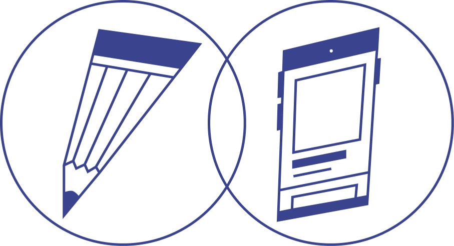
Programs: Canva, Visual Studio Code, Fetch
Timeline: 3 weeks | December 2021

Click this image to view a short video of Chloë coding this website.
I designed and coded this interactive website using HTML5 and CSS in 3 weeks. It is a prototype resource guide for the Women’s Resource and Research Center at the University of California, Davis, where I used to work. It has six pages that each explain a resource the center offers as well as a front page that acts as a table of contents.
The current Women's Center website is just a very small section of the UC Davis website. It's difficult to find among all the other programs the university promotes and difficult to navigate because of its cluttered, text-heavy interface. Most of the page's real estate is taken by things that are not related to the Women's Center.
Ideally, this new website would be a separate entity from UC Davis and have an intuitive interface to eliminate any pain points for student visitors.
I want a simple, functional design that is pleasant for students to use and view. I also want it to match the Women's Center's visual aesthetic.
Most of the content is from the current website for the Women’s Center but this version is easier to navigate and matches the visual theme of the center. The current website is visually overwhelming, so I designed this website with blank spaces and pale colors so the eyes can rest. I also minimized the amount of text on the homepage by using custom icons. It was important to me to make all the Women's Center's services available to browse right away, so users don't have to go through endless drop-down menus to find what they're looking for.
This is a simplification of the original website, but makes it easier for users to learn about resources that the center provides. This website is responsive and resizes to fit well on any screen size, from tablet to desktop. It is not currently available to view online.
This website is responsive and resizes to fit well on any screen size, from tablet to desktop. It is published online so feel free to explore!
Download the prototype here